Tableau Public is a dynamic platform that empowers data enthusiasts and professionals to craft and share interactive visualizations online. In an era where data is increasingly important, effective visualizations enable us to quickly grasp complex information. In this post, we’re showcasing five of our favorite Tableau Public dashboards. Each dashboard offers high quality design and functionality but also a lot of fun, reminding us of the joy of data exploration.
1. The Marvel Cinematic Network
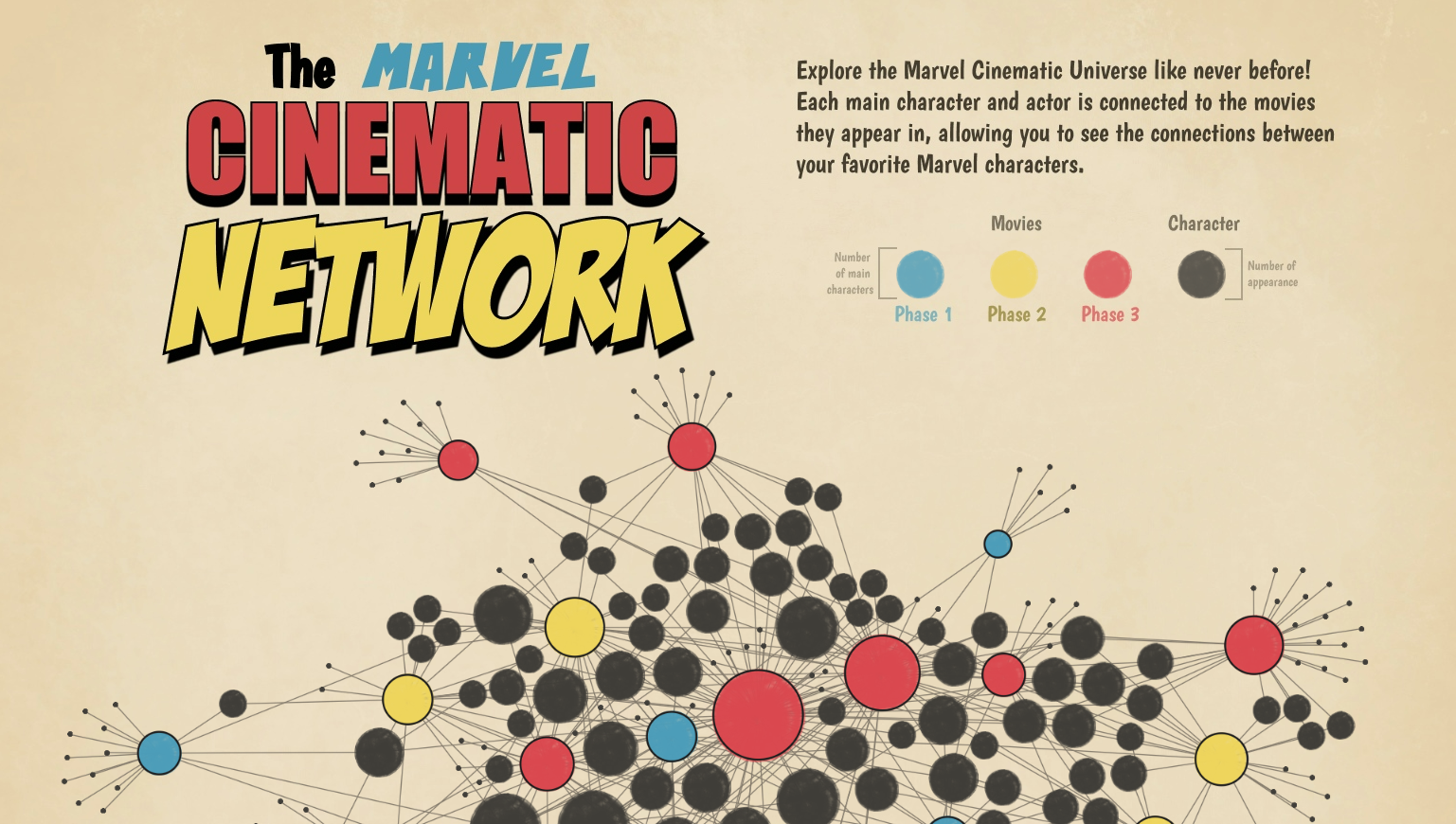
Created by Tristan Guillevin, this engaging Tableau Public dashboard immerses users in the Marvel Cinematic Universe. From showcasing which Marvel characters are in each movie to analyzing box office success, this dashboard offers an interactive deep dive into the world of Marvel.
Key features include:
- Interactive Network Graph – The interactive network graph shows which Marvel characters are in each movie and color codes each movie by Marvel phase.
- Detailed Pop-ups – Pop-ups provide additional details including movie title, scores, and worldwide box office figures.
- Trends Over Time – The dashboard shows release dates of each Marvel movie along with character counts and their respective scores.
Use this dashboard for inspiration if:
- You are looking to visualize relationships or connections between different entities.
- You need to show data in text format in addition to on the graph.
- You are looking to show trends over time clearly and effectively.
2. World of Tea

Embark on a journey through the rich history and global production of tea with this thoughtfully designed dashboard created by Yash Shah. It offers a detailed exploration of how tea has evolved and spread across different regions of the world.
Key features include:
- Interactive World Map – The interactive world map highlights total tea production by country.
- Timeline Visualization – The timeline visualization chronicles the history of tea production and consumption in a visually compelling and interactive way.
Use this dashboard for inspiration if:
- You are showing data on a global scale.
- You are looking at historical events and want a complete timeline.
3. Where On Earth People Aren’t
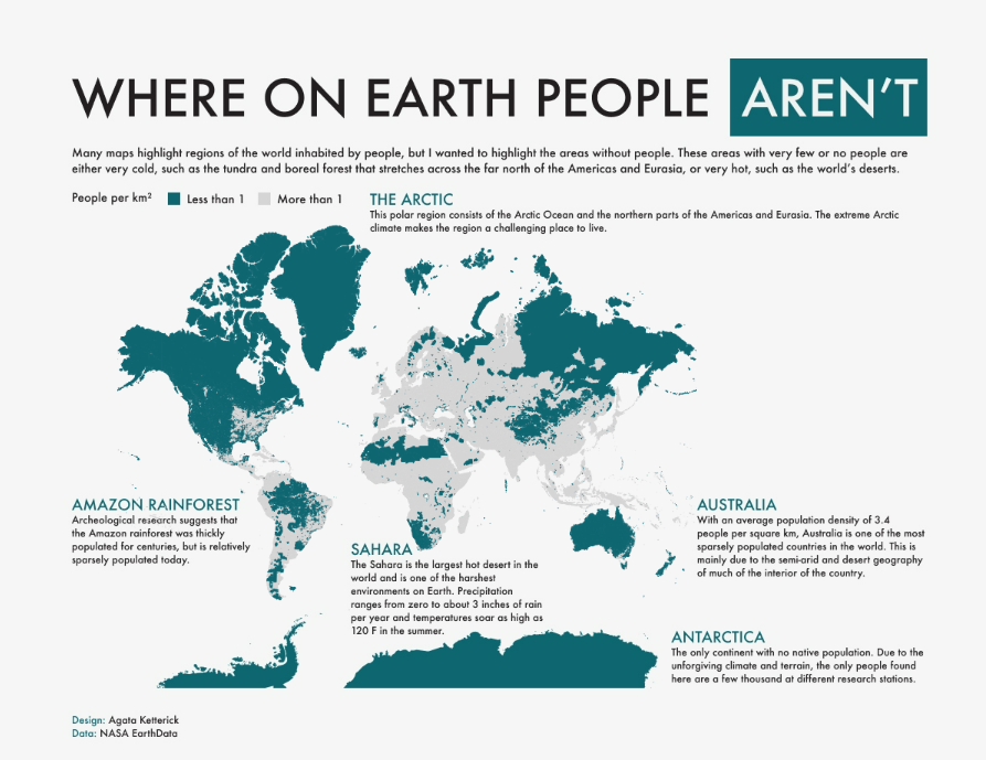
Created by Agata Ketterick, this intriguing Tableau Public dashboard provides a visual exploration of Earth’s vast uninhabited regions. It sheds light on human settlement patterns and offers a unique perspective on where people choose – or choose not – to live.
Key features include:
- Interactive Heat Map – The interactive heat map showcases which areas have the lowest population density (i.e. less than one person per square km).
- Data Insights – The dashboard offers written insights into why certain areas remain uninhabited.
Use this dashboard for inspiration if:
- You are showing data on a global scale.
- You want to include text based insights along with your visualizations.
4. Cat’s Trip: GPS tracking data of Domestic Cats in the US
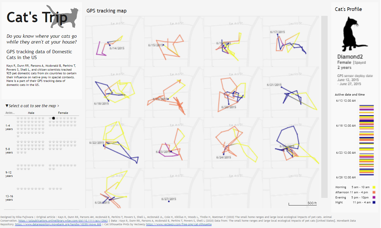
Curious about where your cat goes when it’s not at home? This playful dashboard created by Rika Fujiwara visualizes the GPS tracking data of domestic cats, revealing their roaming patterns and offering insights into their secret lives.
Key features include:
- Filters – The dashboard allows users to select a cat by name, age, and gender to view their typical walking patterns.
- Route Visualization – The dashboard displays paths taken by cats broken down by active date and time.
Use this dashboard for inspiration if:
- You need to set up a custom filter.
- You want to visualize the route or path of something over time.
5. Oscars | Best Picture 1929 – 2024
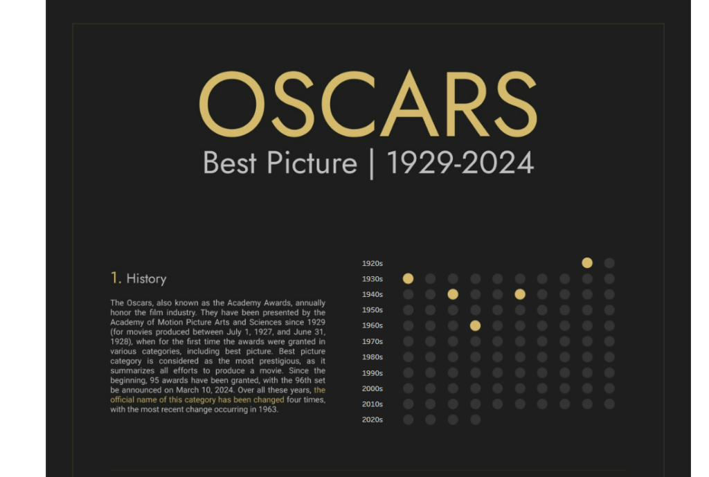
Dive into the history of the Oscars with this comprehensive dashboard created by Krzysztof Bieniek. The dashboard focuses on the Best Picture category from 1929 to 2024 and visualizes trends, predictions, and noteworthy moments in cinematic history.
Key features include:
- Interactive Dot Plot – The interactive dot plot shows the Oscar Best Picture nominees and winners throughout the years.
- Detailed Pop-ups – The detailed pop-ups showcase the director, producer, country, genres, IMDb rating, and synopsis of each nominated movie.
Use this dashboard for inspiration if:
- You are looking to showcase an item being selected from a list of options over time.
- You want to add additional text based information to your visuals.
Conclusion
There are many other Tableau Public dashboards that combine powerful data visualization with entertaining insights. We encourage you to check out Tableau Public and use it to inspire your own data journey within Tableau.
Looking for additional inspiration or help with Tableau? We can help. Check out our Tableau consulting services today!

